Pages

Tuesday 23 May 2017

Ukura - All in the family

WALT: Create graphs to communicate ideas

Answers below:


Answer Below:
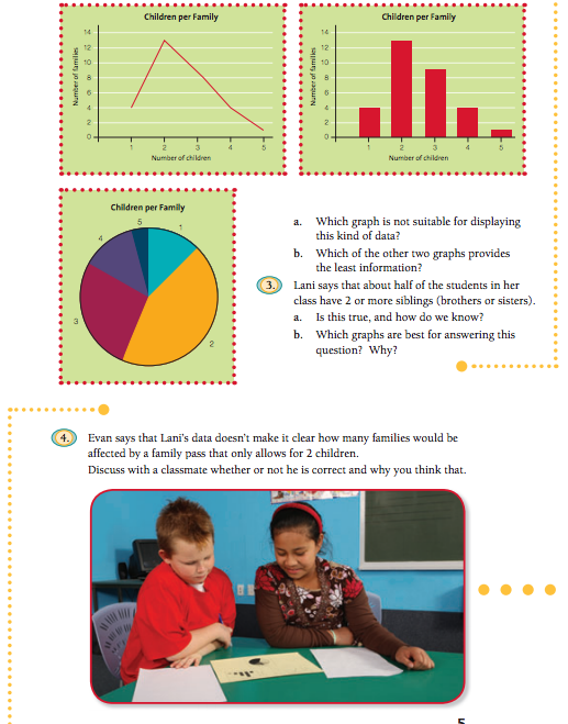
  1. The line graph is the graph that isn’t suitable of finding the statement of data.

     B. The pie graph shows less information.


3.
  1. This is true. How I know is because all the three graphs show that the number two is the highest number.

    B. The bar graph is the best for answering these questions because it is easier and a fast way to figure it out.


4. What me and my classmate discuss was that Evan is not correct I think because Lani’s data is the correct data cause she said that half of her students in her class have 2 or more siblings.  


      Activity two:

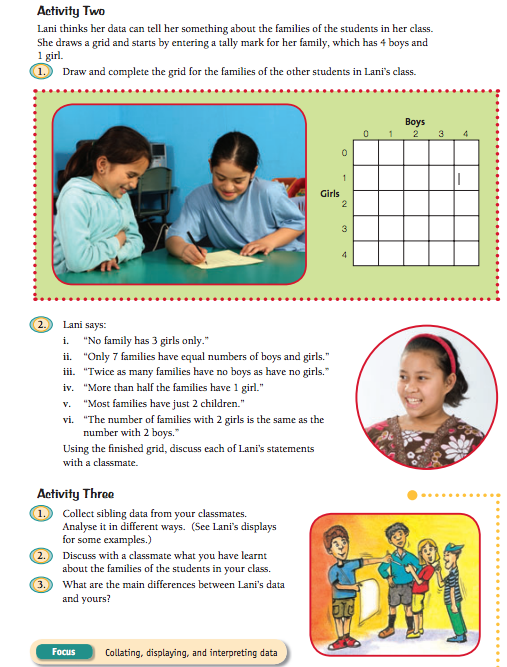
 1. This is my grid for the families of the other students.  Screenshot 2017-05-23 at 9.19.53 AM.png

2. Lani says “”
i) True
ii) False
iii) False
iv) True
v) False
vi) True

Activity three:

1. My classes sibling data:

Family numbers:
1. 2  parents + 3 kids
2. 2 parents + 3 kids
3. 2 parents + 5 kids
4. 2 parents + 6 kids
5. 2 parents + 6 kids
6. 2 parents + 9 kids
7. 2 parents + 8 kids
8. 2 parents + 11 kids
9. 2 parents + 7 kids
10. 2 parents + 6 kids
11. 2 parents + 4 kids
12. 2 parents + 6 kids
13. 2 parents + 3 kids

2. What I have learnt from the Families and siblings is that I now know how to use a bit of graphs and grids. The grids are know easy for me to use, before I didn’t know how to use the grids until now.

3. The main differences about my graph and hers is that my graph has the amount of parents, amount of brothers, and amount of sisters that my classroom mates have in their families and Lani’s graph was different to mine because she had numbers of the family’s and she didn’t list hers as how many parents they had and different things to mine.


This week we have been learning all about the different graphs. What this task asked me to do was that it asked me to follow instructions and answer all the questions correctly. I hope that you have learnt something but what I have learnt was that I learnt how to use graphs in many different ways.

Monday 22 May 2017

The great marble challenge

WALT: Make sense of new information before, during and after reading by connecting it to myself, texts I know and my world.


This weeks task is to finish of work from the previous weeks. And I am finishing off my reading presentaion that I haven't finished from last week. So take a look at it and I hope you enjoy.

Tuesday 16 May 2017

Food Tech - Cooking, our last session with Mrs Heka

Today was the last session in cooking class with Mrs Heka. Last week on Tuesday we at the end of the session we got to pick out what food we wanted to cook for today so we all choose to make Burger with fries, here are some photos of the final templates and some descriptions.


This is the burger that I have cooked for cooking class down at Tamaki College with Mrs Heka. Inside there is a mince pattie that we have cooked by ourself using mince, 1 onion, 1 teaspoon of sweat chillies sauce, 1 egg, and herbs. In this burger there is tomatoes, salad and a egg inside with some tomatoe sauce and a bit of mayo sauce on it as well.

This is the fries that we added to our burgers to make something even better to go with it and that's all I have from what we have done today. I just want to say a special thank you to Mrs Heka for teaching us how to cook in her class, I know that we all were excited from the first day we started cooking. I know that you love us all especially my group......... Just kidding. But we will see you at tech anyways.


Monday 15 May 2017

T2W1 Complex sentences

WALT: Identify the features of complex sentences


Complex sentences. What we have to do with complex sentences was that our teacher gave us a presentation to work on and it had all these different questions and sentences that we had to write and it had an example as well. So please take a look at what I have done so far.

Friday 12 May 2017

Beating the wind

WALT: Recongise cause and effect


This week we have been learning all about cause and effect. What we did this week was that we had to read a book called " Beating the wind". What I have to do was that I had to answer all the questions that my litracy teacher has gaven us to work on. I hope you enjoy what I have learned.

Monday 8 May 2017

Too much telly

WALT: Intepret a range of different graphs.


Answer below:

1: More TV have been watched on Saturday and Friday but homework hasn’t been done on Friday and Saturday.

2: Each of the graphs are different from each other because Jessie missed two days of homework, Ashna didn’t watch TV on Monday and on Thursday, Ruka watched tv 6 ½ times.

3: Yes it is true because the more you watch tv the more you don’t get your homework done and on Jessies graph it says that she spent 14 ½ times watching TV and 2 times on homework, Nina’s graph says that she has spent 11 times watching TV and 5 times spent on homework, Ruka’s graph says that she has spent at least 4 ¼ on doing homework and she spent 11 times watching TV.
----------------------------------------------------------------------------------------------------------------------------------

Hey guys here is my maths for this week. What my maths work for this week is all about is that it is all about different graphs and how we can use different ways to solve a problem easier. What I learnt this week is that I learnt what the difference about each graphs and here is my work to go with this paragraph. I hope that you enjoy my blog post and learn something but besides that please feel free to write a comment down below and tell me what I have to learn more about or just leave a feedback thank you.


Thursday 4 May 2017

My choice square

WALT: Interpret a range of different graphs.
  1. Why do you think Mr Winiata drew a question mark?:
         He put it down as no fruit.
     
     2. Each student chose one of the fruits or the ? and drew it on a blank choice square. Jo collected all these choice squares to display the results.

Jo made a strip graph like this:                          

Screenshot 2017-05-04 at 9.42.31 AM.png

Kim made a bar graph like this:                     Tarak made a pie chart like this:
                                                                         
Screenshot 2017-05-04 at 9.42.52 AM.png                          Screenshot 2017-05-04 at 9.43.03 AM.png

Which graph do you think most clearly shows Room 8’s favourite fruit? Explain why.

The most clearly graph that shows Room 8’s favourite fruit is the bar graph that Kim made. The reason why I think that it is the bar graph because the bar graph has numbers on the side which easily shows what the most common fruit is, it also has the name of the fruits.


------------------------------------------------------------------------------------------------------------
This week we have been learning all about graphs and what we had to do was that we had to answer these questions that our teach has given us and post them on our bog. This is all what we think the best graph is.